Case study
A1 Pest Control
An independent UX/UI concept redesign that transforms A1 Pest Control’s content-heavy website into a clearer, more trustworthy service experience.
Independent Concept Redesign
This case study was created independently to demonstrate my design and development process. It is not affiliated with or commissioned by the business.

My role
Responsibilities
Stack
Year
Timeline
The opportunity
Reframing a content-heavy service website around customer needs
A1 Pest Control is a Sydney-based business backed by more than 40 years of industry experience, specialist termite knowledge, and over 200 five-star reviews. Its existing website contains a substantial amount of useful service, location, and educational content, but the value is often obscured by dense layouts, repeated sidebars, and competing calls to action.
For this self-initiated concept, I explored how the website could better help homeowners identify the right service, assess the company’s credibility, and request help without sacrificing the detailed content that supports trust and search visibility.
The three-day design sprint focused on three representative experiences: the homepage, About page, and quote enquiry page.
This project was created independently for portfolio and educational purposes. It was not commissioned by, affiliated with, or endorsed by A1 Pest Control.
Want to see the thinking behind the outcome?
Jump ahead to the research and product decisions that shaped the final experience.
Proposed solution & expected impact
A clearer path from pest problem to trusted next step
I reorganised the experience around three customer needs: finding the right service, deciding whether to trust A1, and knowing how to request help.
The homepage became a routing experience, introducing A1’s core services, termite specialisation, credibility, and contact options in a deliberate sequence. Detailed information remained accessible through service-led navigation and structured content sections.
The About page transformed a long narrative into a clearer company story, bringing Bruce’s experience, professional credentials, approach, and customer proof into distinct, scannable sections.
The quote page combined direct contact information with a guided enquiry form, pest selection, location details, and clear next steps. This reduced uncertainty while helping A1 receive more useful information from each enquiry.
As an independent concept, the outcome represents intended UX improvements rather than performance measured on a live website.
Before

After
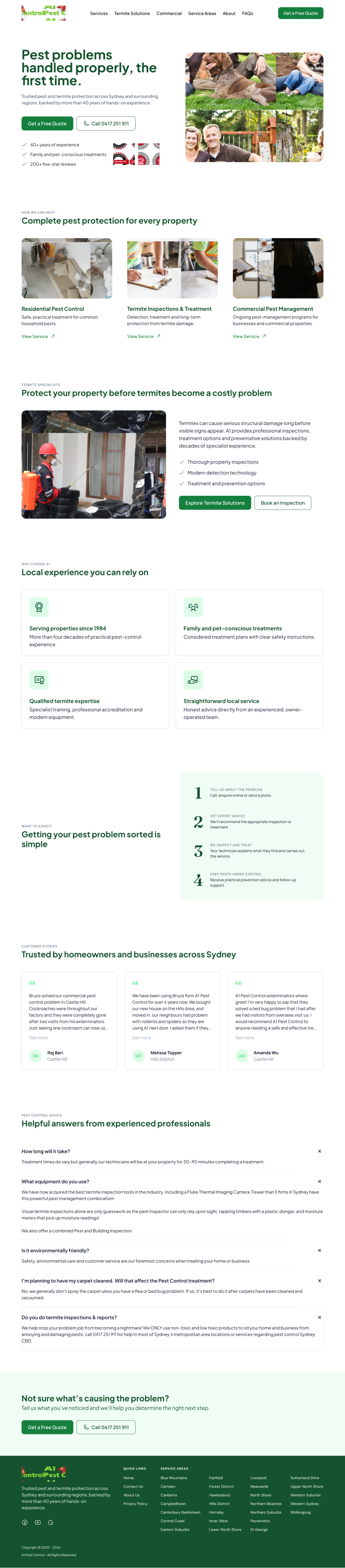
— Hover panels to scroll through full content
- 3
- Core page experiences redesigned
- 40+ years
- Industry expertise brought forward
- 200+
- Five-star reviews used as trust proof
Discovery
Understanding where useful content became friction
I began by reviewing the existing website from the perspective of a homeowner dealing with an unfamiliar or urgent pest problem. I examined how services were organised, where credibility appeared, how location content was presented, and what users encountered when trying to contact the business.
Because this was an independent concept without access to analytics, customers, or internal stakeholders, the discovery phase relied on a heuristic evaluation and content-led review rather than formal user research. The goal was to identify visible usability issues and establish practical design priorities.
Methods
- Heuristic evaluation
- Content audit
- Information architecture review
- User journey mapping
- Visual hierarchy review
Content depth lacked clear hierarchy
Most pages contained valuable information, but long paragraphs, inconsistent heading levels, and limited visual separation made it difficult to distinguish essential answers from supporting detail. Visitors had to read extensively before understanding the service or next step.
Services were organised around pages, not problems
The navigation exposed broad service categories, but did little to help visitors who only knew the pest they had encountered. Common problems such as termites, rodents, spiders, or unidentified damage needed a more direct path into the relevant service.
Strong trust signals were buried or fragmented
A1’s experience, licences, specialist training, and customer reviews were compelling, but they appeared across long pages, certificate scans, sidebars, and repeated testimonial cards. The strongest reasons to trust the business were not consistently positioned near key decisions.
Contact options competed instead of working together
Repeated forms, phone prompts, service-area lists, and sidebar content created visual competition. The enquiry experience also offered limited guidance about what information to provide or what would happen after submission.
Location content overwhelmed the primary journey
Long lists of serviced regions appeared repeatedly across pages and sidebars. While valuable for local discovery and search visibility, they distracted from the immediate task of understanding services and requesting help.
The audit revealed that the website did not need less information. It needed stronger prioritization. The redesign would preserve A1’s valuable content while introducing clearer entry points, scannable sections, contextual trust signals, and a more focused route to enquiry.
Designing the experience
Designing for clarity without removing depth
The redesign was guided by a small set of decisions intended to make the website easier to navigate while protecting the content, credibility, and local relevance already established by the business.
Lead with the customer’s problem
I brought pest types and core service categories forward so visitors could begin with what they were experiencing rather than needing to understand A1’s internal page structure.
Summarise before explaining
Each section introduces the essential answer first, followed by supporting information or a route to deeper content. This preserves the website’s expertise while making long pages easier to scan.
Place trust near decisions
Experience, qualifications, reviews, and safety-conscious practices were repositioned close to services and calls to action, providing reassurance when visitors are deciding whether to enquire.
Give each page a focused purpose
Repeated forms, testimonial stacks, and region lists were replaced with contextual components. The homepage routes visitors, the About page establishes credibility, and the quote page supports conversion.
Design a system that can scale
Reusable navigation, service cards, proof points, content sections, and calls to action establish a consistent framework that could extend across A1’s service and location pages.